Two weeks after publishing our comparison of LLM coding tools, the feedback was clear. People weren't looking for another "best tool" debate. They wanted a way to choose a tool for their specific situation.
That feedback became the trigger to build something practical: a selection app that helps you pick a vibe coding tool based on your actual needs.
The app: AI Dev Tools
AI Dev Tools is a simple chooser. You answer questions about your situation (setup effort, skill level, budget, workflow, goal) and you get a shortlist of tools that fit. Nothing fancy, just practical.
"Dutch tool brings order to AI stack chaos"
Emerce on AI Dev Tools (Dutch) →
Why I built it twice
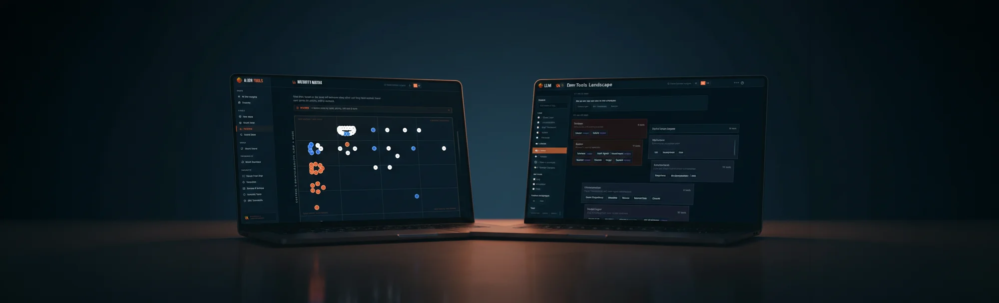
In my previous article I compared four tools. For this build, I continued that experiment with two of the "winners": Google Antigravity and Claude.
Same goal, two different tools, two separate apps:
stackscout.thinkahead.digital
View apptoolselectie.netlify.app
View appClaude app instead of CLI
One change from my previous test: I didn't use Claude Code CLI this time, but the Claude app. Functionally there's not much difference, but the app is easier to get started with, especially if you're not comfortable working in the Terminal. Lower barrier, same capabilities.
Notes from the build
Antigravity: the matrix UI needed refinement
The dataset came together quickly. Most iterations were in the matrix interface: comparing tools across multiple criteria, aligning the indicator dots precisely, keeping them readable, and getting the responsiveness tight across different screen sizes. It's in a good place now, with some room for extra polish.
Claude: the compare section needed UX fine-tuning
The compare feature (selecting multiple tools and viewing them side by side) turned out to be mainly a UX exercise. The first versions were functional, but not consistently clear and predictable in behavior. After a few rounds of feedback it clicked: clean, logical, and pleasant to use.
Cross-checking paid off
Here's why building twice was worth it: each tool had blind spots the other caught.
Antigravity let a few edge cases slip through in the matrix that it didn't flag as problems itself. Claude caught those quickly. And for Claude's compare section, it helped to look at how Antigravity solved similar interactions.
That back-and-forth justified the double build. These tools complement each other when you use them in parallel.
Conclusion
For this build, I'd call it a draw with different strengths. Antigravity was fast for the initial structure and feels more visual during development. Claude was strong at handling detail work and refinement.
The real takeaway: for anything beyond a quick prototype phase, building with two tools and cross-checking is worth it. It catches edge cases and UX issues that neither would spot as quickly alone.
What's next
I'll keep AI Dev Tools focused on the most-used tools. If you think a tool belongs in that core set, or if you spot incorrect trade-offs in the current version, let me know via the contact form.
Feedback or suggestions?
Missing a tool in AI Dev Tools or see room for improvement? I'd love to hear it.